The "I"s Have It; Majuscules Out of Context

"I"s "T"s or "J"s? Who knew context was so important?

"I"s "T"s or "J"s? Who knew context was so important?

"What letter is this?" I demanded of my husband. 

"Errr, it's a very pretty one..."  

"Yes, thanks," I replied, "but WHAT letter is it?" 

He furrowed his brow. "It's a...J?...no, wait, a T. It's a really pretty T. Or a J. Or maybe a Y."

Spoiler alert: it was none of those letters. 

My letter "I" was a stand-alone letter, produced for a fun little project called the Ransom Note exchange that was organized by the lovely Erica McPhee via The Flourish Forum. In short: participants make a number of copies of one letter. Send your letter out and you'll get a bunch of random letters back—those letters will spell out a word or phrase. 

As soon as I received my assigned "I", I panicked. The letter is easy enough to write, but in many calligraphy alphabets it's virtually indistinguishable from the letter J (meaning the hubs wasn't far off after all!). In fact, some alphabets don't even include the letter J.

Why?

Because J wasn't always a letter! For more, lets turn to the internets: 

"J originated as a 'swash' letter used for the letter "i" at the end of Roman numerals when following another 'i". (Thank you, Wikipedia.)

"The letter J was first distinguished by the Frenchman Pierre Ramus in the 16th century, but did not become common in Modern English until the 17th century...early works such as the first edition of the King James Bible printed the name Jesus with an I." (Thank you, Quora.)

Any Indiana Jones nerd can attest to this truth. 

So I did a little experiment with my majuscules, writing out my "I"s, "J"s, and "T"s. Sure enough, they were all similar. After all, most letters are nothing more than an ever-changing series of foundational strokes with small tweaks in the finishing. A "B" is nothing more than an "R" that's been tucked in at the end. An "F" is a "T" with the tail coming across the body. I could go on and on...

I, T, and J

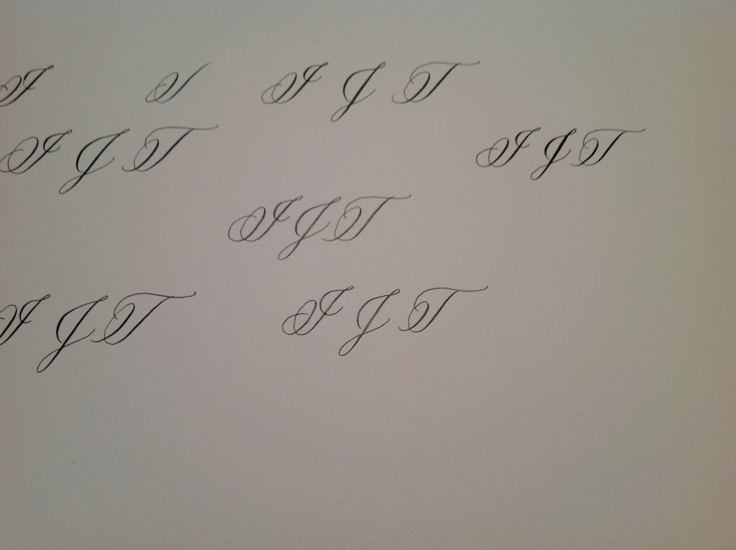
But when placed next to one another, each letter giving the others a little more context, the confusion goes away. It's amazing what our brains can do with just a little bit of helpful information.

So what's my solution for making my "I" more clear for the Ransom Note exchange? A little context! Check my Instagram for the final product. And don't worry—all letters will go through the husband check before going out the door. 


Top photo: PearlEx pigments in Solar Gold and Rose Gold, Hiro 41 nib.
Bottom photo: Sumi ink, Zebra G titanium nib.

Posted on March 14, 2015 and filed under Lettering.

Shades of Grey (Envelopes, that is)

Admittedly, I have neither read nor seen 50 Shades of Grey but that won't stop me from jumping on the grey (err, gray) bandwagon! (Why gray not grey? Because "a" is the Americanized spelling of the color; "e" is the British spelling and I'm a Yankee, yo!)

I love love LOVE the color gray. There's something about the shade that just does it for me. It's warm and comforting but not too boring, it's present but not in your face, it's a neutral that plays nicely with just about any color but it's also beautiful on its own or against a simple black or white. And give me some variation like a minky brown gray or a purple-y gray? Swoon. I'm in love.

As far as gray envelopes go, there are gorgeous choices to be had: Neenah makes a light "antique gray" as well as a deeper "pewter" color in its Classic Crest line; French Paper Co. produces a stunning "steel blue" shade and a brooding "steel grey" that would be an absolute knockout with gold lettering on top.

But it's not only envelopes that get in on the gray fun! Private Reserve makes a lovely "gray flannel" ink that I'm dying to try, and Pearl Ex, my newest obsession, makes not only a stunning "gray lavender" but also a pigment called "mink" that's just the right blend of brown, gray, pink, and purple to set my heart aflutter.

Turns out there are way more than 50 shades of gray, and I'm dying to try them all.


Posted on February 14, 2015 and filed under Envelopes, Inks.

Putting a Stake in the Ground

What is it about calligraphy that I really love? What draws me to it?

I think about this a lot. Not in a heavy, heady way, but it's a question that pops into my mind when I take notes in a meeting (and find myself flourishing) or when I scroll with the mouse at my computer (and practice whole-arm movement). 

If I think back, I remember being four years old, living in McKeesport in a cute white house with a green awning, and always admiring my mom's smooth, curvy, loopy cursive. Before entering kindergarten I begged my parents to teach me to write my name (not print—write). They complied, of course, but none of my school compatriots could read it just yet. I was triumphant when, in second grade, we practiced loops, stems, and swoops as a class. Finally my mates were digging into the loops and swirls that I'd been practicing alone for years. My hand and brain worked in harmony.

Cut to: college, grad school, and the workaday world. Stacks of full notebooks, my private works of art, were prized for their visual beauty as much as the notes they conveyed (the medium is the message, after all). None of this was calligraphy per se, but it was all leading up to this love affair. 

Today I stake the claim: I am a calligrapher (!). Every day I sit down to my workspace and confront that blank piece of paper. I start with the basics: oval drills, straight lines, push-pulls, etc., etc., and it's fun and frustrating and beautiful (always a little bit more beautiful the day after—like beer goggles in reverse). Sometime's it's a slog, most times it's totally fun, and in some ways I've been practicing for this job all my life. Scarlet Day Calligraphy is who I've always been. Ta-da! Here I am!

Posted on February 8, 2015 and filed under About Scarlet Day.